Blank page
An empty text field is the hardest part of keeping a diary. Every InMood entry starts with a question instead.
Personal app concept · iOS · Self-initiated
InMood is an emotion diary I designed for myself. I wanted one calm place to name what I feel, write down what happened and, when the feeling is a hard one, go through it step by step until it loses its grip. Around the diary I added short theory, self-tests and guided practices, so the app can explain a feeling as well as record it.
The concept is designed end to end, from the first promo screen to the paywall. It has not been built or tested with users yet.
01 · The problem
Most mood trackers stop at the record: a face, a colour, a note. That helps you notice patterns later, but in the moment a strong feeling still has nowhere to go. I wanted the diary to answer the next question too: now that I know I am angry, what do I do?
When a strong feeling hits, I want to understand it and choose what to do, so it does not choose for me.
A second, quieter job sits next to it: keep track of the good things, such as achievements, wishes and gratitude, so the diary is not only a list of bad days.
An empty text field is the hardest part of keeping a diary. Every InMood entry starts with a question instead.
After naming a negative emotion, the app offers to work through it right away, inside the same entry.
Reminders, a short promise to yourself and a diary that greets you by name are there to make writing a routine.
InMood is a personal concept. I have not run user interviews yet, so the next section is my problem framing, a review of three existing apps and a plan for validation. It is not a set of findings, and nothing in it is drawn from respondents.
02 · Research kit
Before validating anything with users, I separated three things: what existing products already do well, who I think the app is for, and which beliefs the design depends on. Each belief has a way to test it.
I looked at how established mood apps structure an entry and where they stop. Each one shaped a decision in InMood.
| App | Core idea | What I took | Where InMood differs |
|---|---|---|---|
| Daylio | A micro-diary: pick a mood, add activities, optional note. Moods and activities feed a calendar and statistics. | Fast entry, a calendar of past days, statistics as a reward for regular use. | InMood asks about the situation behind the feeling and can turn the entry into an exercise. |
| How We Feel | Built with the Yale Center for Emotional Intelligence. A colour-coded grid of emotion words and strategies for regulating them. | Naming a feeling precisely, and colour as part of the meaning. | InMood keeps a short set of basic emotions and puts the guided exercise inside the entry itself. |
| Moodnotes | A mood journal grounded in CBT. It helps you spot thinking traps such as catastrophising. | Guided questions that lead to a healthier view of the situation. | InMood adds entries for positive moments: achievements, wishes and gratitude, plus fear of acting. |
Built from my own habits, not from interviews. It is the person I designed for and the first thing I would test.
| Belief | Where it lives | How I would test |
|---|---|---|
| Questions keep people writing longer than an empty field | Every entry type starts with a prompt | Prototype test: compare finished entries with and without prompts |
| A negative entry needs a next step | Offer to work through the emotion, anger worksheet | Interviews about the last strong feeling; share of users who accept the offer |
| A small promise helps the habit stick | “Contract with myself”, hold to commit | Retention in the first week, with and without the step |
| People write honestly only when the diary is private | Password and Touch ID in the profile | Interview question on what stops honest writing |
| Positive entries make people come back | Achievement, wish and gratitude diaries | Mix of entry types over time |
| Working through feelings is worth paying for | Premium: guided work, extra diaries, statistics | Fake-door paywall and trial starts |
Six to eight conversations with people who have tried keeping a diary. The questions ask about real past behaviour, not opinions about the app.
How the moment I designed for unfolds, drawn from my own routine. The bottom row shows where InMood steps in.
| Something happens | Open the diary | Name it | Write it out | Work through it | Look back | |
|---|---|---|---|---|---|---|
| Doing | A conflict, bad news or a task I am afraid to start | Picks up the phone later that day | Tries to find the right word for the feeling | Describes what happened | Wants to calm down and decide what to do | Scrolls back through past entries |
| Thinking | “I should not feel like this” | “I have no energy to write a lot” | “Is it anger or hurt?” | “Where do I even start?” | “So what now?” | “Is anything changing?” |
| Pain | The feeling takes over | Effort, blank page | Vague words | Rumination on paper | No method | No visible progress |
| InMood | Reminders and a daily greeting | One question at a time | Eleven basic emotions, up to three life areas | Prompts per entry type | Guided worksheet with before and after intensity | Calendar, cards and statistics |
03 · App map
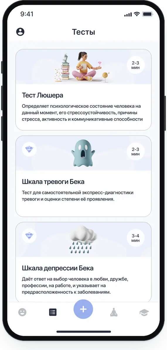
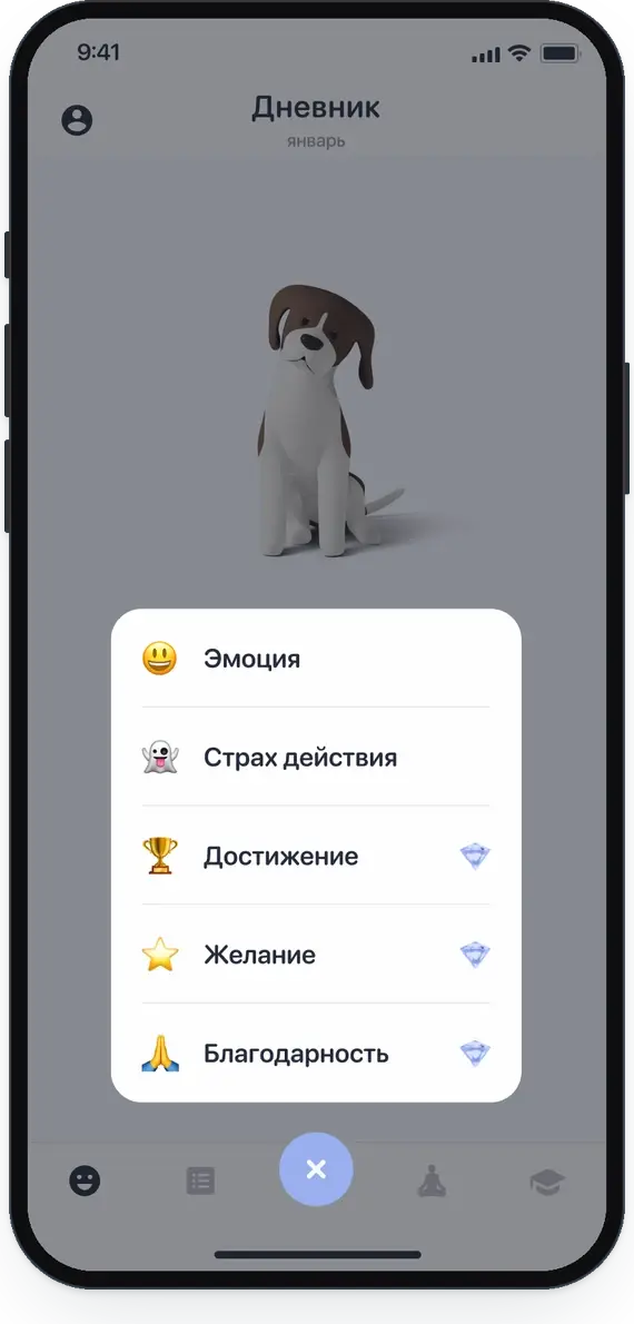
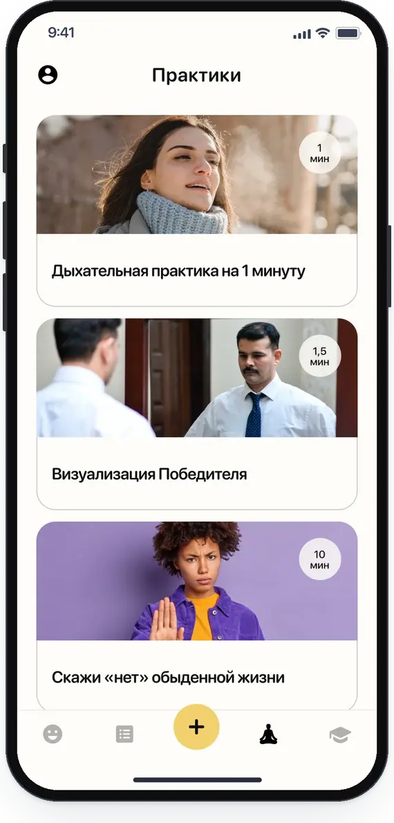
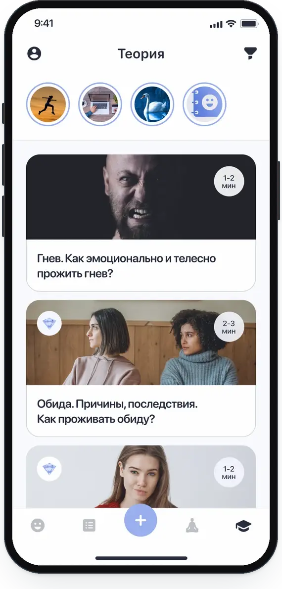
The tab bar keeps the diary on the left, learning on the right and the new entry in the middle, where the thumb rests. Profile and Premium sit outside the tabs, so they never compete with writing.
First run
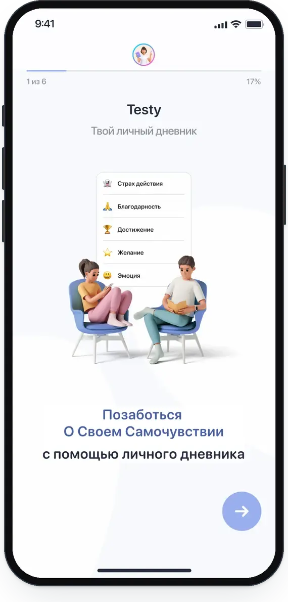
Six slides: diary, practices, tests, working through negative feelings, theory, statistics
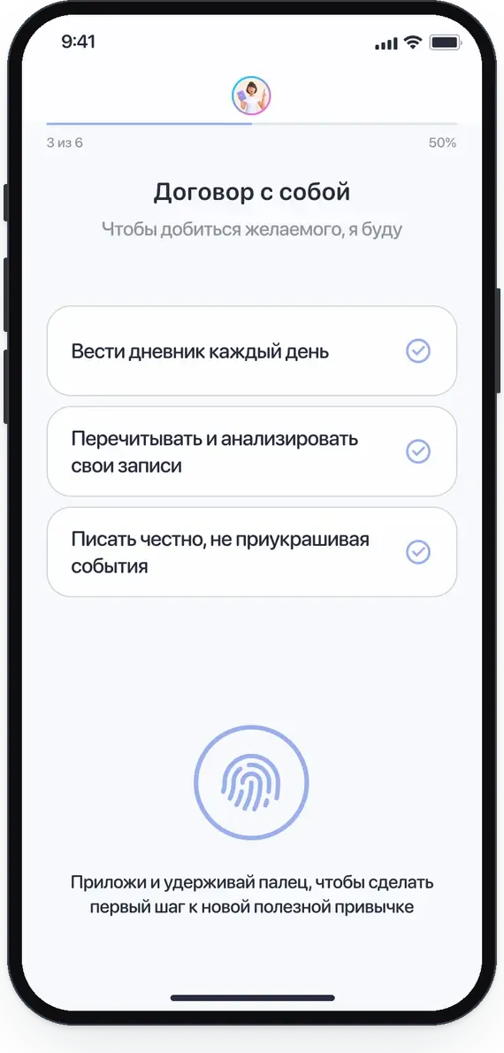
Name, welcome, contract with myself, reminders, colour theme
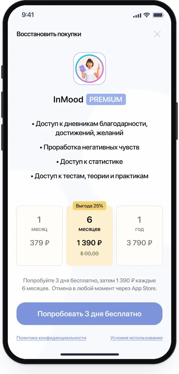
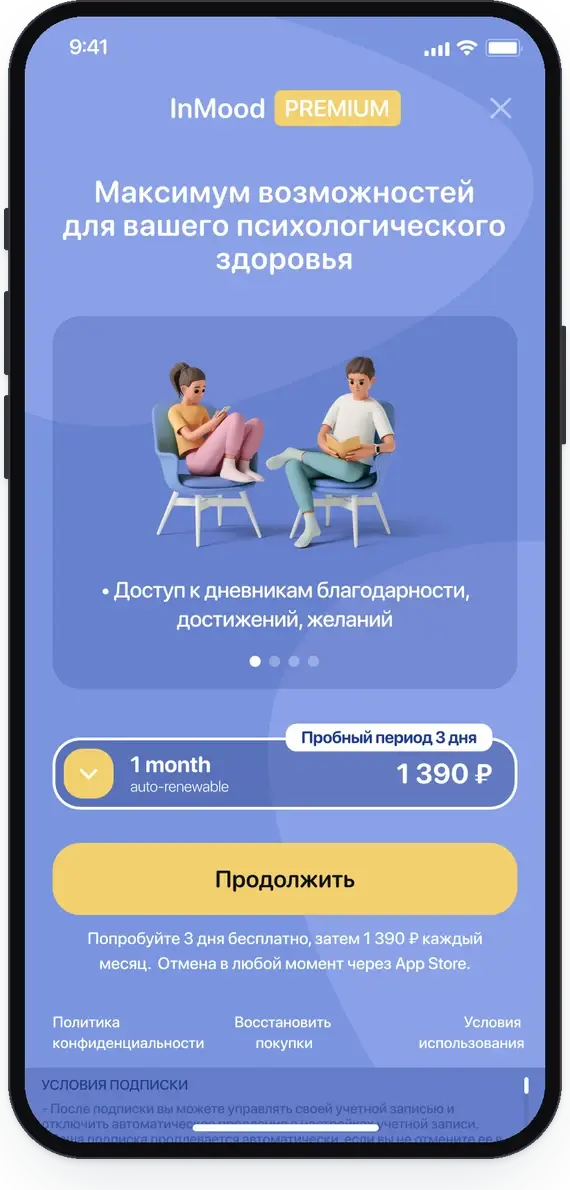
Three-day free trial, can be skipped
Tab bar
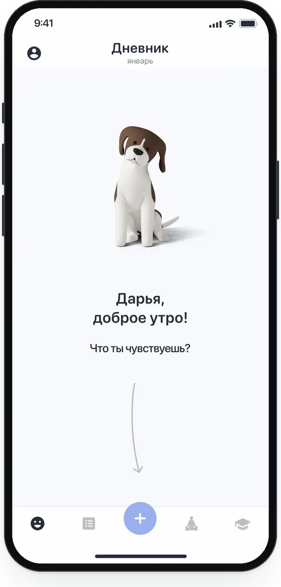
Home tab
Outside the tabs
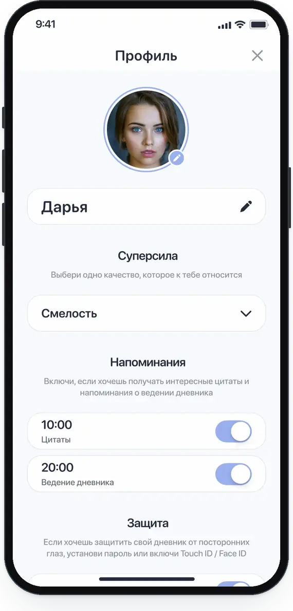
From the avatar: name, one personal strength, reminders, password and Touch ID, app colours, rate, share
Gratitude, achievement and wish diaries; working through negative feelings; statistics; tests, theory and practices
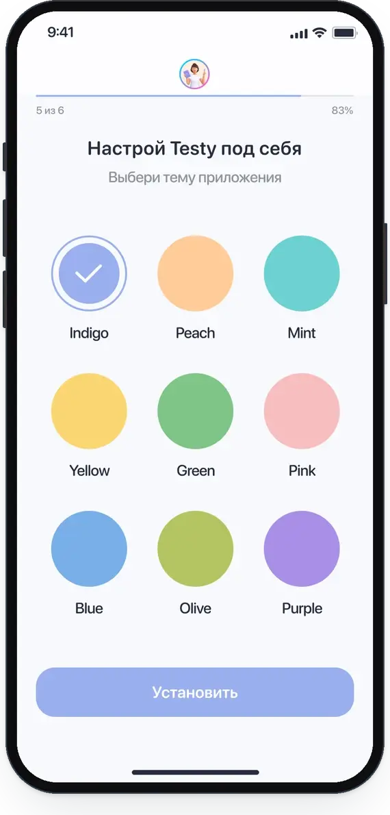
Nine palettes, chosen in onboarding and changed in the profile
The red outline marks the core action.
04 · First run
Onboarding asks for a name, then for a small commitment: write every day, reread your entries, be honest. The user holds a finger on the button to agree, which turns a checkbox into a ritual. Reminders and a colour theme come next, so the app feels personal before the first entry.
The plus button opens five entry types. Each one starts with a question and ends with a card in the diary. An emotion entry takes three short steps: pick an emotion, pick up to three life areas, describe what happened.
The key flow of the app. It rates the feeling, lets you draw it, then moves from the unmet need to what you want to do and what is important to do. At the end you rate the feeling again, so the change is visible.
The home tab greets you by name and time of day. A week strip shows the emotions of each day, and entries are listed as short cards with an icon for the type. Statistics count how often each emotion appears.
05 · Learn, test, practise
Three tabs support the diary. Theory explains each emotion in five short cards. Tests give a structured look at anxiety, mood and life satisfaction, with a history of results. Practices are guided exercises from one to ten minutes, with a breathing timer for the shortest one.
06 · Make it yours
Colour matters in an app about feelings, so the user chooses it. Every theme is built from the same six tokens: two backgrounds, text and icons, a primary colour, a darkening layer for alerts and a text line. One set of layouts works in all nine themes.
The profile keeps personal settings in one place: the name the app uses, one personal strength, reminder times and protection with a password or Touch ID.
07 · Premium
The emotion diary is free. Premium adds the diaries for gratitude, achievements and wishes, the guided work on negative feelings, statistics and the full set of tests, theory and practices. The paywall starts with a three-day trial and shows the saving on longer plans.

App icon. Early screens use the working name Testy; the final name is InMood.
08 · Next steps
Looking at the concept again, I see what it needs to become a product. These are the first things I would do.
Run the interviews above, then test the anger worksheet as a clickable prototype with five to eight people.
An app about hard feelings needs a clear way to reach professional help, and the tests must say that they are a self-check, not a diagnosis.
Entries per week, return in the first week, share of negative entries worked through, and intensity before and after.
Some pastel themes need stronger text and icon colours to meet accessibility contrast.
Replace the working name Testy with InMood across onboarding and promo screens.
Start with the emotion diary and one guided worksheet, then add tests and practices once the habit is proven.
InMood is a project I love, because I designed it for a need I know well. It shows how I think about a product from the first screen to the business model, and it is honest about the step that comes next: putting it in front of people.
